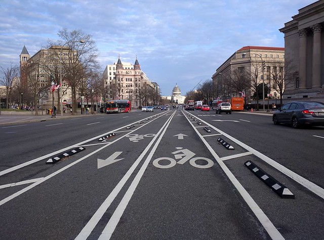
By and large, we are optimists here at Copenhagenize Design Company. In our extensive travels around the world to our client cities and to give keynotes, we are privileged to see so many cities changing for the better and working to reestablish the bicycle as transport on the urban landscape. We get to work with great cities to help them make it happen. I’ve ridden bicycles in over 70 cities around the world with my work and while often the infrastruture is sensible, once in a while I am presented with weird stuff. Like the photo, above, taken in Washington, DC by our colleague Ole Kassow of Cycling Without Age. Initially, our team of planners and urban designers here at our Copenhagen office had a good laugh but then it sinks in. This is actually a thing. Someone was tasked with putting in bicycle infrastructure and THIS is what a city ended up with. Center-running lanes.
Here's the rub. Best Practice in bicycle infrastructure is basically a century old. Dedicated bike paths date from 1892 when an equestrian path was turned over to bikes on Esplanade in Copenhagen. In 1915, the first on-street, curb-separated cycle track was installed on Strandboulevarden. From there, protected bike infrastructure spread out around the world.
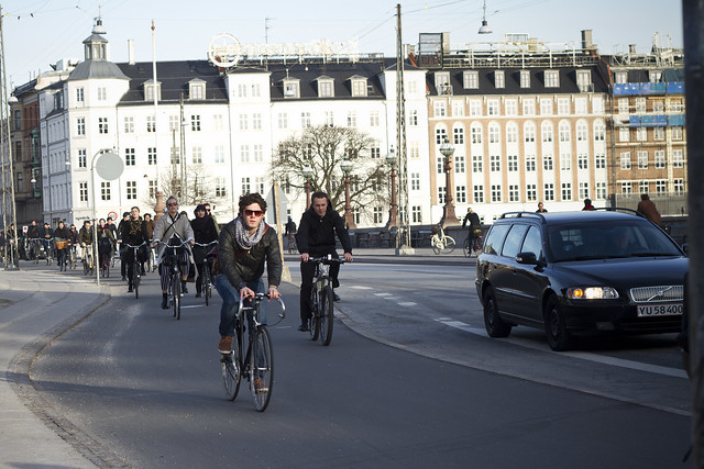
Over 100 years, the infrastructure has been tested by easily hundreds of millions of daily cyclists. Planners have tweaked and experimented, made mistakes and fixed them and ended up with a Best Practice that is simple, effective, safe and cost-efficient. Generations of planners and engineers have done an amazing job and just handed us everything we need on a silver platter. There are only four types of infrastructure in Danish Best Practice. One of the designs fits any street in the nation and any street in any city in the world. Copy-paste, baby.
Why, then, do we see crap like in the photo, above, showing up on city streets? Who, in their right mind, would ACTUALLY choose to put cyclists in the middle of a street with speeding cars on either side? Certainly not anyone with an understanding of the bicycle's role in urban life as transport or a sincere desire to encourage cycling and keep people safe. As I suggested on Twitter, find the person who is responsible and fire them. A flippant remark - but still a serious one.
The primary problem is that traffic engineering, in certain countries, still has influence on planning and urban design. In America, where this infrastructure was put in, bicycles are placed in the same category as motorized vehicles. In countries that GET the bicycle's role in cities, they are regarded as fast-moving pedestrians and we've been planning for them for a century.We work with planners and engineers all over the world so we realise the challenges in changing the old-fashioned, car-centric mentality. It is, however, 2016. Planning for bicycles is child's play. Or should be.
Cycle tracks run parallel to the sidewalk. Separated from the motorized traffic. Period. It's not rocket science. Looking at the photo from Washington, DC, my first thought is, "how am I supposed to get to a destination in mid-block"? Do I go up to the next intersection and walk my bike back? Why would I want to cycle with my kids or my grandparents on a barren wasteland as cars fly past? No humans were considered in the development of this solution. There is no respect for access, safety and no broader idea of an intelligent, cohesive network."Oh, but it works!" You hear muttered from the wings of urbanism. What works, exactly? Cycling down this stretch is possible, yes. We are, however, planning our cities for the next century of transport. It is important to plan properly, using solutions that are tried and tested. Using cyclists as guinea pigs in solutions whipped together by lazy, car-centric engineers is ridiculous when we know the best way to approach it. Don't even get me started on the folly of on-street bi-directional lanes on stretches with cross streets.
I wonder if the people who mutter, "oh, but it works!" have homes filled with chairs sporting only two and a half legs. Technically, they work. You can take a load off. Rest your tired limbs. But they are not exactly Best Practice. We figured out as far back as the Neolithic period that four legs or a solid base is the best way to design a chair. This is the chair at the moment in too many cities. Bits and pieces that don't connect up in a network, loads of sharp edges but technically - they tell us - it works. None of us have four of these in our living rooms.
If we design cities for humans, with respect for the human experience, safety, logic and ease-of-use, you wouldn't see stuff like a bike lane in the middle of a street, or sharrows, in any city. Engineers stare at computer screens and geek out on mathematical models. Designers think about the human on the other end of the design process. It's a human to human process. Let's design our streets like we did for 7000 years before we invented the automobile.
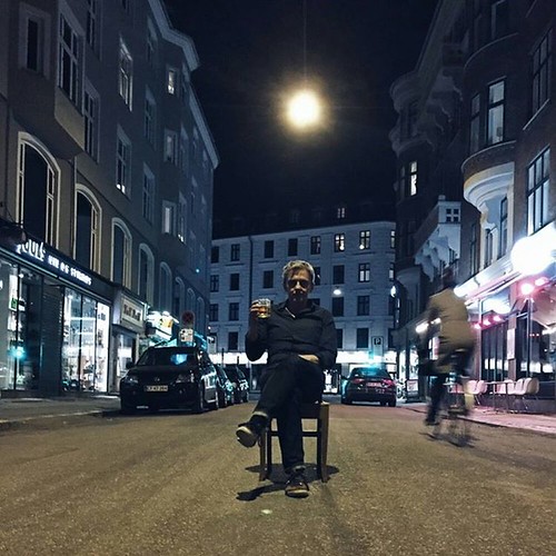
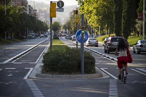
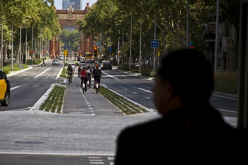
The proponents of this center-running lark call it "context sensitive design". Just using the word "design" is an insult to generations of bicycle planners who worked so hard to establish best practice. The DC solution is engineering. By people who don't understand human-centric design. But for those who insist on putting humans in the wasteland, what about just going all in? I tested the theory at my local wine bar the other evening. "Oh, but they have them in Barcelona!" Yes. And in Nantes. And in Sao Paulo. Does that mean it's a good idea? No. It just means that these cities have allowed themselves to listen to engineers instead of designers. I have ridden on the ones in Barcelona several times, on holidays with my kids and while working. No access to destinations in mid-block. Wide, arrogant intersections that force you to speed across them. The City is currently revisiting these designs, realising that they are not "all that". The one in Nantes is shouldered by low-speed car and tram lanes that allow easy access back and forth across the street. The one in Sao Paulo is an even bigger brain fart than the one in DC. One difference about Barcelona is that most of the city is a 30 km/h (20 mph) zone. The City is focused on slowing the whole place down in order to save lives, reduce injuries and create a more life-sized city. The center cycle tracks lead to roundabouts, which make at least a bit more sense than throwing you into a car-centric intersection. The infrastruture in DC is focused on the fit and the brave, not the 99%. Hardly an intelligent way to grow cycling as transport. One rule of thumb to consider is a simple one. If you don't see an infrastructure design in the Netherlands or Denmark, it's probably a stupid infrastructure design. If you wouldn't put pedestrians in a center-lane between moving traffic, why the hell would you put cyclists there. It's all been invented. It's all right there, ready to use. Not using established Best Practice is three steps forward, two steps back and this is the time that we need to step boldly forward with confident, intelligently-placed strides. Don't worry. The engineers and planners we need to fire will probably get another job. There's other engineery stuff to do. When it comes to our streets, let's use designs and ideas that make sense.