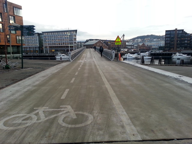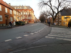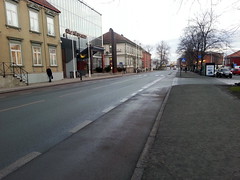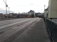
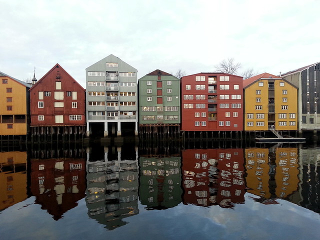
I travelled to Trondheim, Norway earlier this week, to give a keynote at the Tekna Kursdagene conference. This engineering “Course Days” conference has been held for over 50 years in the city. There are many categories for many branches of engineering, including urban development and - the category I was speaking at - traffic. I was, unfortunately, unable to take in other categories like “Fatigue of risers and pipelines - offshore” or “Lavkarbonbetong/Miljøbetong”. Hey, you gotta stick to what you know. While I was in the city, I simply had to have a look around. I’ve heard so much about Trondheim through the years. The number of trips by bicycle is pushing 10% and, by all accounts, it is one of the best bicycle cities in Norway. While Trondheim is trying to move forward, the rest of Norway is lagging behind and is like the USA of Europe with its focus on automobile infrastructure and unwillingness to embrace more intelligent transport forms. So here’s a little bicycle urbanism travel reportage from the oh so beautiful city of Trondheim one January day in 2014.
The bridge reminded me of another bicycle/pedestrian bridge in Trondheim and of one of the most brilliantly positive campaigns we've seen in the past six years. Read about THAT right here.
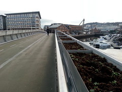
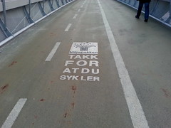
I love the flower boxes hanging on the side and would enjoy seeing them in full bloom in the spring and summer. Low and behold, in the middle of the bridge, was a text that warmed my heart. Directly inspired by Copenhagenize Design Company's communication template developed for the City of Copenhagen's Bicycle Office. It reads, simply, "Thank you for cycling" (Takk for at du sykler). Nice.
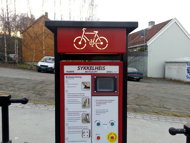
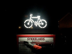
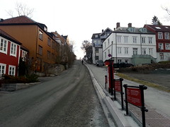
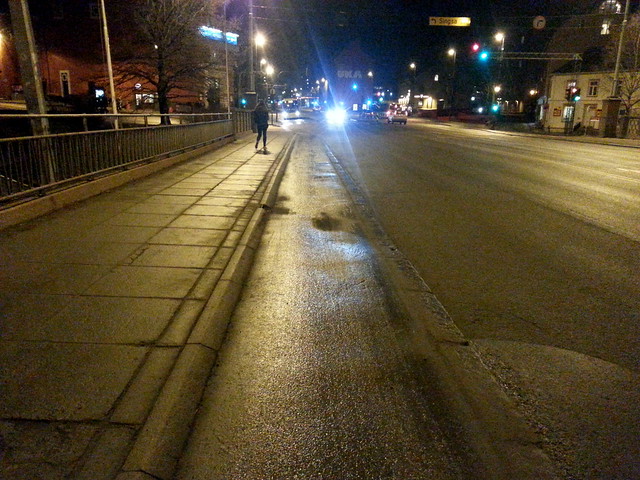
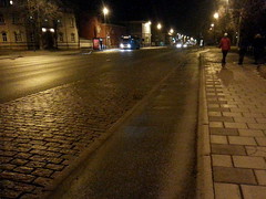
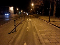
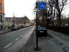
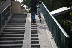
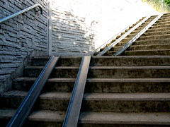
One thing that put Trondheim on the bicycle urbanism map was their Bicycle Lift. We wrote about it back in 2007, with a little film. Now it was time to see it. Except, uh, it was closed for the winter. Oh well. As a few people said on Twitter, "Make sure you see the bicycle lift that nobody uses!". So I did. It was a great idea back in 1992 and has been useful for a whole lot of hype. But I can't see how this has been a game changer, apart from the branding value. The bicycle lift was renovated a couple of years ago and a French company took over the production of them. I've seen these bicycle lifts exhibited at a number of conferences/fairs since 2009. Has anyone ever seen one implemented in a city since 1992? Nah. Thought so. It was, however, fun to see it. On the photo at right, a citizen is just muscling his way up the hill on a vintage upright bike, past the out of service bicycle lift. On the way back from dinner, I saw something quite cool. A grade-separated cycle track. In NORWAY! Not very wide, but hey. It was there. My colleague with whom I was walking back to the hotel with commented that technically it was iillegal to ride on it. Apparently the State Road Directorate - Statens Vegvesen - still think it's 1961. In the handbook they publish (recently updated), such Best Practice infrastructure isn't allowed. Indeed, in the Q&A at my session at the conference a woman from the Road Directorate said in no uncertain terms - responding to a question about why Best Practice isn't in the book - that "you can't just take ideas from other countries and import them to Norway." She actually said that. So... Norway rejects Best Practice bicycle infrastructure based on a century of experience. Surprise, surprise... the country is one of the only ones in Europe where cycling levels are falling. So these stretches in Trondheim, where the cycle track continued and was accompanied by a stretch of traffic buffering cobblestones, as well as skirting around a bus stop (at right) are subversive protests thumbing their nose at the Norwegian State Road Directorate. Activism in Asphalt. We approve.
The report that Copenhagenize Design Co. and Civitas produced for the Norwegian Transport Ministry in 2012 (pdf link) was commissioned by the Ministry simply because they were tired of hearing the same old, same old, last century, car-centric nonsense from the Road Directorate.
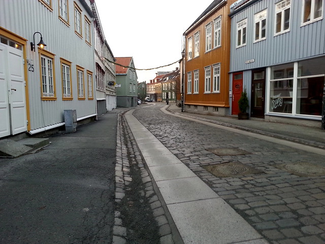
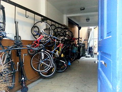
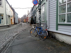
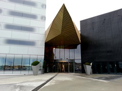
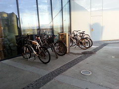
On to the old neighbourhood of Bakklandet. Quaint, wooden houses along the river. Cobblestones galore. But a couple of nice strips of pavement tiles for cycling down the street. It's in the details sometimes. Peering through the open door to a back courtyard with both offices and homes, I spied the bicycle rack, at left. The weather was unseasonably warm when I was there. There were impressive numbers of people still riding bicycles all over the city, but it's clear that many have also hung up their wheels for a couple of months. At right, some lovely bicycles remain on the street, ready to go. Some more infrastructure. Painted lanes, albeit with a reddish colour, are seen many places in the city. Most run along the sidewalk, like they should. At left, however, is a bit of a brain fart. Here the bike lane forces bicycle users to act as a buffer to protect the parked cars on the right. Looking at the stretch of street, it really wouldn't have been so difficult to have continued the bike lane along the sidewalk, leaving the cars on the left. Protecting cyclists instead. At right, another stretch of bike lane over a bridge. Reassuring.The Clarion Hotel and Congress is a shiny new hotel on the harbour from 2012, designed by Norwegian architects Space Group. It is a splendid building from top to toe. But... What really frustrates me is how architects design a building in excruciating detail and then forget to plan for bicycle parking. The result? Someone who actually understands mobility needs has to put up a bike rack outside the excruciatingly designed building. Usually a bike rack that doesn't match the architectural integrity of the building, just one that works. Because they need it in a hurry.
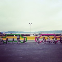
There were two bike racks from Cyclehoop a couple of hundred metres away from the hotel. I love them but while they may not fit exactly the design of the Clarion, they would certainly look better out front.
It boggles the mind that so many architects - by and large city dwellers - fail to plan for the stuff that is going to end up in front of their building. In many cases, stuff they can control. Stuff that that is needed. Stuff that is going to end up there anyway. Like bike racks.
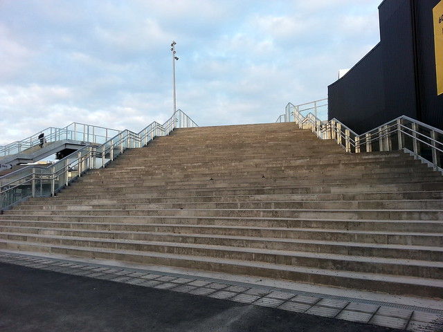
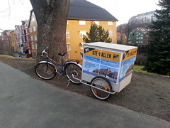
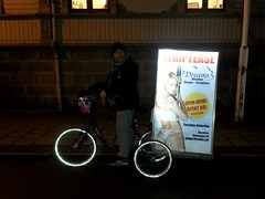
Where is the architect that plans for this eventuality and designs cool, practical bicycle parking in line with the total architectural vision to avoid unecessary ugliness in the form of cheap racks? Then there's the new bridge over the railway by the central station. LOTS of stairs. And yet, no simple addition of a ramp for bicycles. In a city with almost 10% of trips by bike. It boggles the mind. It's not rocket science. Build it in from the blueprint stage, or add it afterwards. Preferably option #1.Last but not least, a couple of lovely Cyclelogistics encounters to calm me down. Two trailers, both used for advertising. A climbing center and a strip club. Hey, don't think Norway is boring.
