
When you come from Copenhagen, cycling in Amsterdam is like coming home. To a different kind of home, sure, but still home. An eclectic home filled with books piled up in no particular order, funky art on the walls, maybe dirty dishes in the sink but cool music on the stereo. Different from home with clean lines, white floors and carefully placed furniture and minmalistic art on the walls. I love cycling in Amsterdam. It’s a wonderfully human experience. You meet the eyes of strangers all day long because of the layout of the city and the constantly changing infrastructure. I’ve often said that Amsterdam cyclists resemble swarming bees whereas in Copenhagen they are more like marching ants. This difference is largely due to the layout of the cities. In Amsterdam the streets are curvy and confusing and you perform many left and right turns in the course of a day. In Copenhagen, there are primarily long, straight stretches. Most of Copenhagen outside the medival city centre is a 20th century invention and, back in the day, planning streets was unencumbered by canals or rivers. It’s interesting to consider the differences in cycling in these two massive cycling cities. It is, largely, a question of personal taste as to what you prefer. A century ago you wouldn’t have noticed any difference between riding a bicycle in the two cities. The differences that are now apparent are merely evolutionary, based on city layout and planning, as well as infrastructure.
Which brings me to an observation I've made. The root of it is based in comments I've heard from dozens and dozens of planners, engineers and participants on our study tours of Copenhagen. Many come from abroad and make pilgrimage stops in Amsterdam - perhaps Utrecht or Rotterdam if they have time - and then Copenhagen - perhaps Malmö if they have time. For some reason, most overseas visitors end up going to the Netherlands first, flying home from Denmark. What I always hear is that Amsterdam and cities like Utrecht are a rush. A big bicycle smile. Wonderful to experience. And rightly so.
Upon arrival in Copenhagen, things change. It's a giggle, as well, for foreign visitors who come here to study bicycle planning, infrastructure and facilities. The difference is that when in Copenhagen, our visitors remark that it's easier to see how bicycle infrastructure would work in their city back home. Squint your eyes a bit and you'll be able to superimpose a Copenhagen street onto a similar street in your home city. When a city resembles other cities it is easier to envision change. Amsterdam is a glorious place but there is only one Amsterdam and there will never be another.Cities that have recently begun the journey to create a more bicycle-friendly environment after a century of failed traffic engineering are - or should be - looking for easy to implement designs and infrastructure networks. A fluid and functional design is paramount when beginning from scratch.
I stay at the same hotel when in Amsterdam and I've been there a lot over the past year and a half. I ride the same route to drop off my bike near the Central Station, a route that by and large bypasses the old city centre and follows larger roads. Despite the relative directness of the route, I have noticed that it is less straightforward regarding bicycle infrastructure. I decided to compare the route with a similar one in Copenhagen. To compare the design of the infrastructure, wayfinding and experience.The route in Amsterdam is here on Google Maps. From the Lloyd Hotel to Het Zwarte Fietsenplan bike shop and rental location.
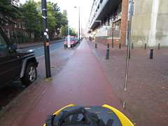
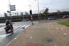
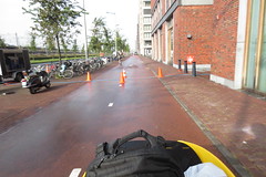
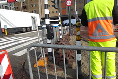
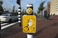
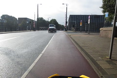
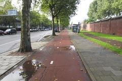
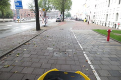
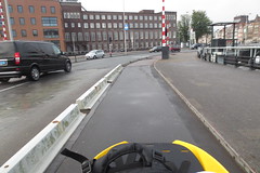
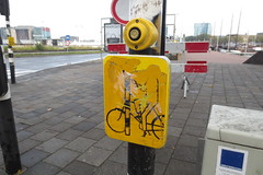
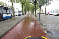
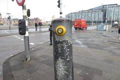
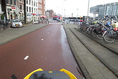
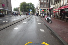
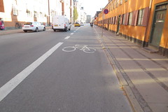
The route starts out well. A separated cycle track with a smooth surface and the reddish colour typical in many Dutch cities. Near the first intersection, the surface suddenly changes to paving tiles of varying colours. Still noticably different in style compared to the left and the right of the cycle track, but odd that it changed. Especially as this section was recently renovated. From riding on a one-way cycle track I turn onto a bi-directional track. Nice and wide and safe, sure, but already here the intuition of the journey is jeopardised. At the first light on this stretch I meet the first crossing button. Having to apply for permission from a computer model to cross a street on my bicycle is a foreign concept for a Copenhagener. I couldn't reach it, due to road works, but the workman pressed it for me with a smile. Nice. Then, because I was turning left, another button presented itself to me just across the intersection. I had to wait. Car volume on this stretch is high and their signals were prioritised. (It's much better in many other locations, don't worry). Finally, permission was granted by the traffic engineering gods and I headed off. This time on a wide, one-way bike lane surfaced with asphalt the same as the road, but one that was only separated by a painted line. Yes, this is Amsterdam. Motorists and cyclists enjoy a symbiotic relationship but I wonder what foreign planners think when they see this. The car volume and speed was largely unchanged, but the infrastructure was different. Uniformity is of paramount importance in design. I continued on. More buttons to cross streets along the way and then suddenly I was back on a bi-directional cycle track. I couldn't really figure out why. But I was back on the classic, red Dutch cycle track surfacing. Well, not for long. Tiles appeared suddenly beneath my cargo bike again. After the tiles I was back on a one-way cycle track, this time separated from traffic with the barrier you see, above. Now, it's a bridge, so a lightweight barrier makes more sense here. Farther along, another of those damned buttons. This was a nice stretch. A wide buffer from the motorised traffic and separated from the pedestrians by the unique red-coloured surface. Oh. Then another button. If you're new to cycling in Amsterdam, you may not notice it. The button is meant to send me across this intersection, which it did after a wait. Into the arms of another button. Which was sending me on a left turn. Which was strange, because I just wanted to go straight. So then I found myself on the LEFT side of the street, on yet another bi-directional cycle track. Never a dull moment. My Desire Lines, at this point, had just rolled their eyes and left the building. A minor change of surface - this time cobblestones instead of tiles - as I crossed this smaller street. I shuddered at the feel of those cobblestones after three days in Utrecht. My vibrating organs went into shock. The bi-directional cycle track continued for a ways, although it did morph into a split cycle track for a while. Then, after a left turn off a bi-directional track that had me looking in eight different directions instead of two, I was back in the ol' school. Makes you understand why on-street bi-directional cycle tracks have disappeared from Danish bicycle planning. Anyway, I found myself sharing the street on a low-speed street. (Well, kind of, cars were moving pretty quick, given all that space.) The last stretch up to my destination was a narrow, painted lane. I got from my A to B safely, calmly and without too much stress in a fantastic bicycle city. I did, however, experience a change in surface about 9 times. I experienced a half dozen different types of bicycle infrastructure and I had to push a button to cross a street 6 times. That's not including the 3 or 4 other ones where I managed to catch the light. I've finally figured out this route, after several visits. I know which direction to go in, but the variety of infrastructure solutions has little regard for my Desire Lines or my human intuition. Which goes for most of Amsterdam. I have friends who have lived in the city for decades and yet who can still spend ten minutes discussing which route is the best to get to that bar. This route should be pretty straightforward, however.Back in Copenhagen, I decided to cycle a similiar-ish route to compare. I rode from Langelinie to Vesterbro, and the route is viewable here on Google Maps. There is a much more direct route for this A to B, but I took some turns and skirted around the city centre to make more of a comparison.
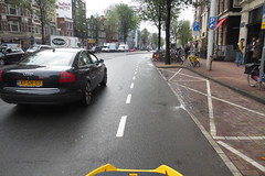
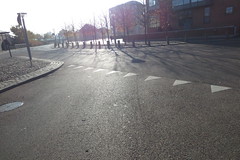
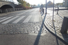
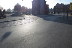
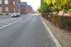
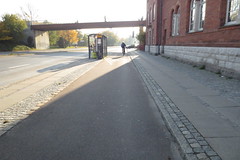
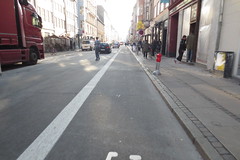
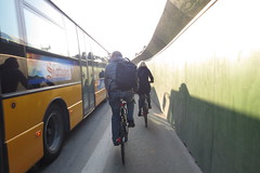
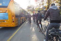
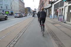
The route started out nice. A low-speed, low car volume street where separated infrastructure isn't needed. There was Utrecht-style cobblestones as a traffic calming measure by a pedestrian crossing in this normally pedestrian-heavy area. A little roundabout and then a stretch along the same calmed street.Before long, I was on a one-way, separated cycle track for a long stretch. Turning left towards the city centre, the infrastructure became a wide, painted lane. I was also on a Green Wave route, where the lights are coordinated for bicycle users in this direction during the morning rush hour.Cycle 20 km/h and you hit green all the way in to the city centre. The painted lane continued. Some right turns later, including a couple of car-free turns, and the lane narrowed in because of Metro construction. This is normally curb-separated but this is a temporary solution. That bus was hardly moving because of traffic. We all zipped right by. Still on separated one-way cycle tracks, I passed busstops. The solution on the right is the City's preferred one, where space allows. But the solution on the left works fine, too. Entering the last street, Utrechtian cobblestones signal a change of speed and streetstyle. Only a narrow strip, fortunately. The last stretch was on a calm, low-speed street lined with small shops and cafés. Apart from a few hundred metres at the beginning and the end, the entire journey was on one-way cycle tracks. About 70% was on the standard, physically-separated, one-way variety. We don't send pedestrians criss-crossing back and forth on their A to B journeys. They have sidewalks on both sides of the street. The same comfort, ease-of-use and intuitive wayfinding should always be applied to bicycle users, as well. No on-street bi-directional cycle tracks to navigate on the route, either. Nor were there any American-style buttons to press to be allowed to cross intersections. The entire journey, apart from two narrow stretches of traffic-calming cobblestones was on one smooth surface type.
As we've highlighted with the Copenhagenize Guide to Bicycle Planning, a uniform bicycle infrastructure design makes sense.
Let there be no doubt. Let us all look to the Netherlands for inspiration. For their national policy - their tradition and desire, even - to plan cities for people. I invoke "Dutch" in our work at Copenhagenize Design Co. very, very often. I push for Dutch-style solutions here in Copenhagen. The Netherlands is a pocket of visionary urban planning goodness that shines brighter than any other beacon on the planet.
What I'm saying is this. We work, primarily, with larger cities. We work with planners and engineers around the world who are still trying to figure this whole "bicycle as transport" thing out. Many are "getting it" but then there's those who are still allowed to put in bike lanes between parked cars and moving traffic, or sharrows, without even getting fired. Uniform design is paramount. A city-wide, copy/paste solution saves money, guarantees results and is a wise, financial move for cities with ever-dwindling budgets. An interesting but confusing (to anyone but the locals) selection of solutions is risky. Plug and play is the key. If you get off a train in a Danish city you've never been to before, you'll quickly find the bicycle infrastructure. It looks like the infrastruture in the last city you were in. It takes you where you want to go safely and quickly. Get off the train in a Dutch city you've never been to before and you spend your first few hours trying to follow the zig-zagging, criss-crossing, ever-changing infrastructure.
I, like everyone else who has tried it, has stood with a stupid smile on my face in Utrecht and Amsterdam. (Although DAMN your cobblestones, Utrecht!) I am inspired by the Netherlands and, wherever possible, do everything I can to reject this Bicycle Nationalism that has emerged over the past few years. That's why Copenhagenize Design Co. teamed up with Dutch company Mobycon for our Kickstand Sessions. To bring the best of BOTH countries to the rest of the world.
What's interesting, however, is how many study trips are now heading to Rotterdam. Green Lane Project, among many others, are focusing on Rotterdam and Copenhagen for their study trips. The rest of the Netherlands may mock Rotterdam for having the lowest modal share among Dutch cities, but let's face it. When you're from North America, 20% modal share doesn't look THAT much different from 35%. If you squint your eyes in Rotterdam, like in Copenhagen, you can envision your home city with bicycle infrastructure.
There is much inspiration out there. Let's inspire the world in the right places and in the right ways. Let's focus on uniform design solutions that provide bicycle users in Emerging Bicycle Cities with ease-of-use and simplfied wayfinding, in order to plant the right seeds. Then we can move on to big, stupid grin solutions once the forest starts to grow.