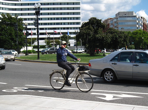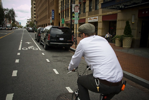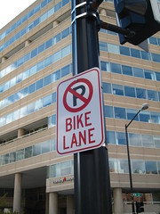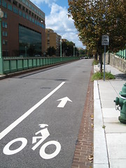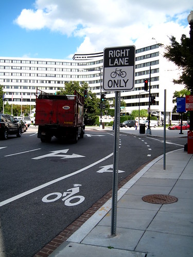
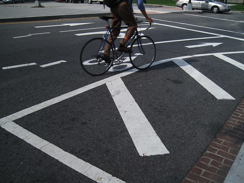
 Visiting Washington DC recently I was quite impressed to see many attempts at founding a language with which to communicate with citizens on bicycles and much of it surrounding separated bicycle infrastructure. If you were dropped blindfolded from a helicopter onto Thomas Circle or many of the nearby streets and removed the blindfold you’d be quite sure to think that you had landed in a bicycle-friendly city what with the bicycle lanes and signage.
Jeff from the League of American Bicyclists showed me around on one of the days and here he is on his Brompton.Let's forget, if we can, the details about Best Practice for design of bike lanes for a moment and just regard the many areas of the city that feature facilities for making cyclists safer, as well as the all-important bicycle-friendly communicational aspect of the graphic design universe aimed at the traffic users.It's quite clear that on the street above bicycles are welcome and are given their own space in which to move, instead of being thrown rudely into the unfair cockfight that is traffic, like it was the middle-ages and where only testosterone-pumped, sub-cultural 'purists' choose to tread.Such infrastructure is not in place for them, the small minority that seek to elbow out all attempts at mainstreaming bicycle culture. It is in place for the Greater Good and the hope that more citizens will take to the bicycle and that both individuals and society will reap all the benefits that follow with it. Let's forget also for a moment the fact that many of the two-wheeled citizens have yet to master the infrastructure and instead choose to dance precariously all over the shop with little regard for the motorists or pedestrians. [although after my visit to NYC, DC seemed as calm and relaxed as a Greek island village]. Signage has been produced, funds have been allocated for it and it is in place. A form of commitment to a bicycle-friendly future has been made. Which is brilliant.
This is all an extension of the symbolism mentioned in an earlier post about Washington DC. The importance of creating not only space but a graphic design language that cements the bicycle as an accepted, respected and equal form of transport. Beacons flashing staccato signals of light that give hope that a safe harbour is within reach before long.
The city has a daunting journey ahead of it but there are clear and present signs that it is on the right [cycle] track. My experience cycling around the city was that it was less intuitive than, say, Paris, but lightyears ahead of New York. It was actually enjoyable, whether I was on a preferred bicycle lane or not.
There was still an overwhelming number of male cyclists, which is the surest sign that much work is to be done. As Dr. John Pucher will also tell you. Although Cycle Chic exists and can blossom, given the right ingredients, along with the rest of the bicycle culture.
And it seems that things are taking a very position turn for the better, as you can read here.
