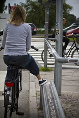
 I’ve been spending a great deal of time thinking about how we can promote cycling positively instead of attempting to scare people. I was extremely pleased to see these posters all over Copenhagen a couple of weeks ago.
This "Hej Cyklist" campaign [Hi, cyclist!] was an idea we came up with at Copenhagenize Consulting a couple of months ago.

Hej Cyklist features on the city's bicycle railings/footrests. The idea was quite simple. A behavioural campaign and a communications template with which Copenhagen's Bicycle Office coulc communicate with the cycling citizens. The average Copenhagener who rides to work or school each day doesn't really pay much attention to bicycle infrastructure or even bicycles. They just ride.
We all have a sense of pride about the city in which we live. Here in Copenhagen we love to hear that we've been voted the world's most liveable city and things like that. I figured that our cycling citizens should be made aware of all the positive aspects of our bike culture, in order to stimulate that inherent civic pride in relation to our cycling life.
For example, very few know that at many intersections the bikes get a green light a few seconds before the cars. Or that at what used to be Denmark's most dangerous intersection, this 'pre-green light' system has reduced serious cyclist injuries from 15 a year to just one. Most people know that there are a hell of a lot of cyclists on the main routes but they are surprised when they hear the numbers - 10,000 here, 25,000 there, 35,000 on Nørrebrogade, etc.I figured that if we let Copenhageners know about the safety features and the positive statistics about cycling, people will respond more positively. Especially in light of the fear campaigns from Dansk Cycklist Forbund and the Danish Road Safety Council.
We pitched the idea to the City of Copenhagen's Bicycle Office and they, too, were positive about it. It is now integrated into their campaigns. The tone of the Hej Cyklist campaign works well in Danish. It has two angles. The title - Hi, cyclist! - has a retro feel to it. Like something you'd hear back in the 1950's or 1960's. A kind of corny, cheerful tone. It is designed to appeal to both the older generation and younger at the same time. The modern font - which is part of the Design Guide for the City - helps make it modern. The messages that will follow are designed to be positive and cheerful. Condescending behavourial campaigns rarely work. Nobody wants publics orgs looking down their nose at them. The poster above, which was plastered all over town, reads:"Hi cyclist! Copenhagen was voted Cycle City 2008 by Danish Cyclists Federation. You are one of the main reasons. CONGRATULATIONS! and thanks for cycling in Copenhagen."
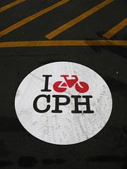
There are many other texts in the works and there are plans to use the Hej Cyklist angle on stickers stuck on the bike lanes, like this one: There are so many opportunities to make our citizens proud about cycling as well as sending out common sense safety messages without the wagging finger of a nanny state. Like the head of the Norwegian Cyclists' Federation once said, "Why don't we ever see headlines like '50 cyclists saved their lives this week BECAUSE they rode their bike to work'..."It's exciting to see A. my idea in action and B. positive branding of cycling in Copenhagen. Kudos to the Bicycle Office for their passion for cycling in Copenhagen.


