 |
| Copenhagen's Inderhavnsbro - Inner Harbour Bridge - Photo: City of Copenhagen |
The Inner Harbour Bridge was riddled with problems and was extremely delayed, as you can read here. Now, however, it's been open since July 2016.
Let me be clear... I'm thrilled that we have a new, modern link over the harbour to accommodate bicycle traffic and pedestrians. I am over the moon that the number of cyclists crossing daily exceeds all projected numbers. The City estimated that between 3000-7000 cyclists would use the bridge but the latest numbers are 16,000. It's a massive success. But sometimes you can see the forest for the trees. I'm sorry, but Inderhavnsbro is a stupid, stupid bridge.It fulfills it's primary function of allowing people to cross a body of water. But it is a cumbersome, beastly thing that is completely and utterly out of place in the delicate urban, historical and architectural context of its location. A fantastic overcomplication of the simple, timeless art of bridges that open and close. Designed by an architect named Cezary Bednarski from an architecture bureau will roots in two countries where cycling is no longer mainstream transport, it has failed miserably in respecting the basic concepts of bicycle urbanism and the established standards for infrastructure and facilities. By the looks of it, Studio Bednarski didn't even bother to understand them.
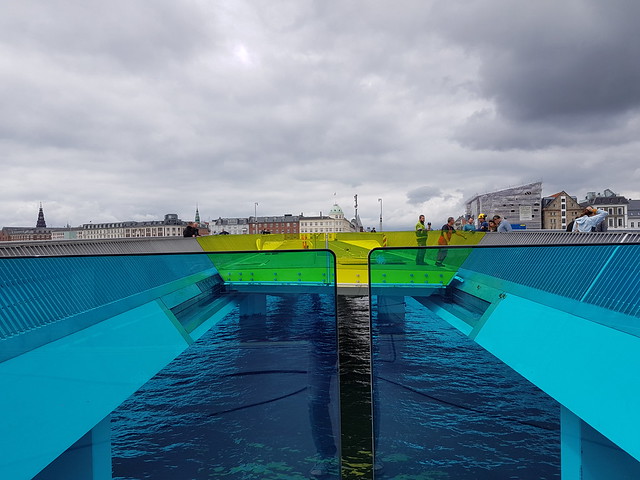
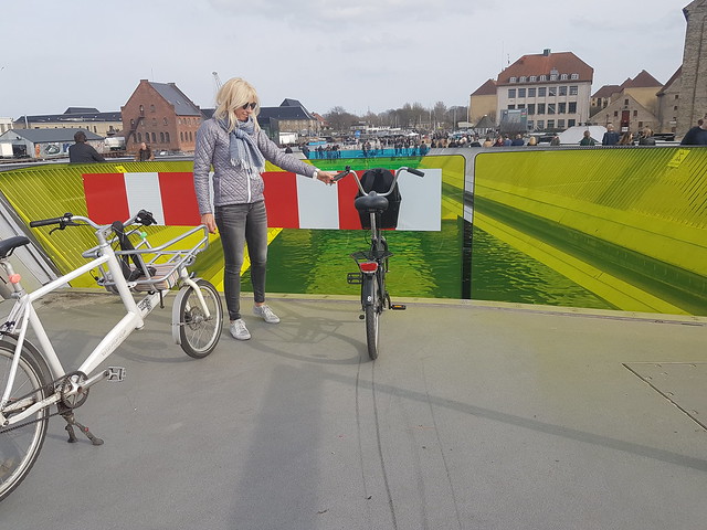
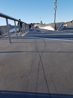
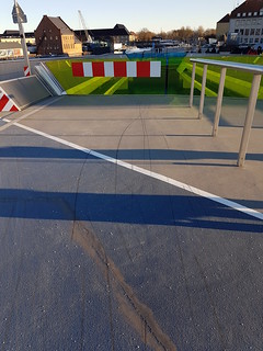
The nickname for the monster is the "kissing bridge" and it is flawed in so many ways. After millenia with perfectly functional designs to cross water like drawbridges and swing bridges, this architect decided to overcomplicate the concept. The bridge meets in the middle, where the two sides "kiss". A nice, giggly idea on a distant architecture office desk but quite stupid in practice. It proved incredibly difficult to make the giggly idea work. Crossing the bridge by bicycle involves two sharp turns - two chicanes. Chicanes designed by someone who doesn't ride a bicycle. Cyclists are shunted sharply and rudely towards the middle of the bridge and back out to the side again. Perhaps the idea of getting the two sides to "kiss" was too difficult with the length of the bridge or the width required to make the kiising part work. The quirky kissing idea is the primary objective, at the expense of common sense. The primary visual gimmick is that the glass panels change colour as the bridge opens. Oooh. Wow. For a century, Best Practice standards for details like chicanes have been in place. We know what curvature works best for comfort and for safety. These chicanes pose serious problems and they are clearly visible for anyone to see. You can see from the bicycle tracks in rain that people just cut the corners of them. A more serious concern is the many skidmarks you see on the bridge as you head downwards in either direction. I stop and study them every time I cross. Have a look when you cross. There are always fresh ones. They stop before the glass barriers, but I figured out why, as you can see in the photo, above. People crown the bridge in the middle and then get speed up, but many people fail to realise that the architect wasn't capable of a straight line and they slam on the brakes and hit the glass. I don't know if anyone has gone over the edge into the water, but the physics provide a perfect storm. Look at the glass barrier in the above photo. The City has realised there is an issue and have slapped up a large, red and white warning sign to try and help people realise that it's a dead-end.If you need to put warning signs on a design, it is basically a crappy design. Period.
The grade to get up the bridge also ignores Best Practice standards for bicycle infrastructure. In this article you can read how most standards were established in the 1920s and 1930s. The architect probably thought "bike" and a spandexy dude on a race bike popped into his head. I have seen a few people get off and walk up the incline, but most just muscle their way up. The bridge is too steep. It is not designed for a mainstream bicycle city and the architect didn't bothering researching the fact that we have 40,000 cargo bikes filled with kids and goods in Copenhagen.
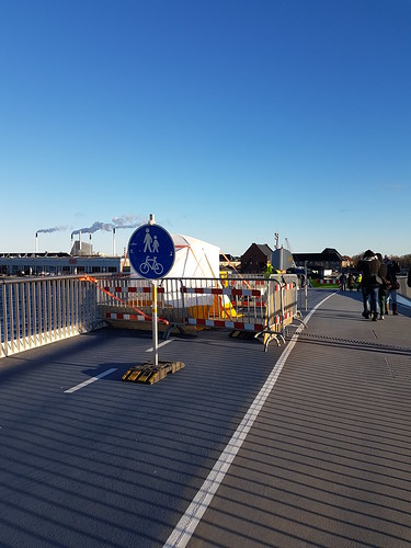
On all the other bicycle bridges in Copenhagen a simple boom will drop to the sound of a simple ringing bell to stop cyclists and pedestrians when the bridge is opening. Compare that simple design to the huge, groaning barriers that rise like creatures from the black lagoon on the Inderhavnsbro. Comical overcomplication. Another detail is that there are no ramps on the stairs on the pedestrian side - unusual in Copenhagen - but necessary. That is easily fixed, compared the rest of the nightmare. Is using municipal funding to experiment with giggly, freestyle designs really a good idea? The bridge was also funded by a philanthropic fund - but does that mean that we don't have to be rational when we get free stuff? I can easily and rightfully criticize the architect who failed miserably at his task, but lest we forget there was a jury of Copenhageners who actually looked at this and voted "YES!" So there are many fools at this party. There are so many moving parts that breakdowns will be inevitable. It's already happened a number of times. Ships have been stuck on the wrong side because it couldn't open. The little tent, above, appeared suddenly and was in place for more than a week. That's hardly good for mobility. A fancy schmancy bridge in Kiel, Germany, ended up having so many problems that another bridge was built next to it, to be used when the fancy bridge breaks down. Is that where we are heading in Copenhagen?The bridge is nothing more than "magpie architecture". A shiny object that attracted the favour of the people who selected it. Seduced by bling and fake innovation instead of being guided by timeless rationality and basic design principles. It follows in the sad tradition of Squiggletecture, where bridges and facilities are designed by architects who don't understand the users.
What's more, in an attempt to appease the wealthy sailboat crowd, the City of Copenhagen agreed to let the bridge open 30 times a month - far more than the six times a month that the other main links over the harbour - Knippelsbro and Langebro -open. This bridge will be unreliable as a transport option for people who are just trying to get to work or education once the sailing season starts. The basic principles of Danish Design - practical, functional and elegant - were sadly forgotten in the choice of this bridge. The shine will wear off and, I fear, we'll be faced with more expensive problems.Facepalm.
