
We felt it was time for another look at the Arrogance of Space, this time applying our filter to an intersection in Sao Paulo, Brazil.
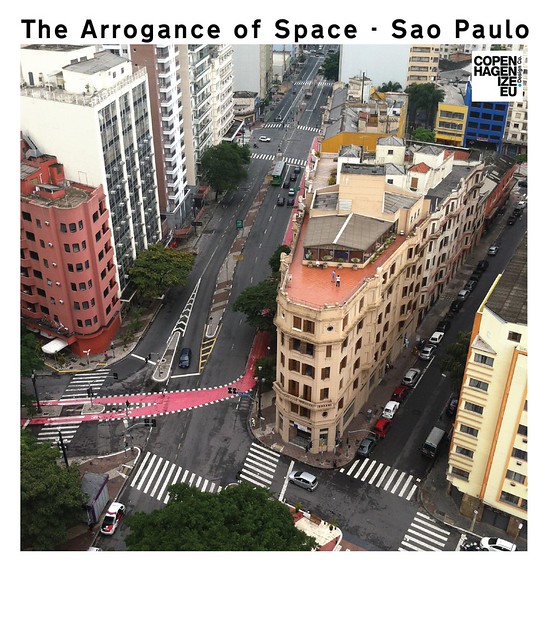
Our friend and colleague Dora Moreira took this photo for us last week - Dec 2015 - of the intersection of Praça Julio Mesquita - Avenues São João & Rua Vitória. It was 16:40 on a Saturday. Looks nice and quiet with not a lot of traffic of any sort. We are, however, looking at the space allocated to various transport forms.
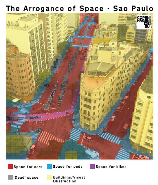
When you apply the colours to the photo, you start to see The Arrogance of Space emerge. This photo is a little deceptive because it is not completely aerial. The yellow of the buildings dominates, so let’s focus on the streetspace. Despite being in the heart of Sao Paulo, pedestrians are not afforded very much space. The angry red of the roads emerges as the clear winner in the space sweepstakes. A token strip of purple denotes some sort of bike lane - far from anything we recognise as Best Practice. Not to mention the fact that paint does little to keep cyclists safe. The Mayor of Sao Paulo is talking up bicycle infrastructure. If THIS is what he has in mind, we’re not impressed. Some leafy trees are visible - the one in the foreground is on a small square - and some line the streets. (Not everyone has time to sit on a bench - most have to go from A to B.)
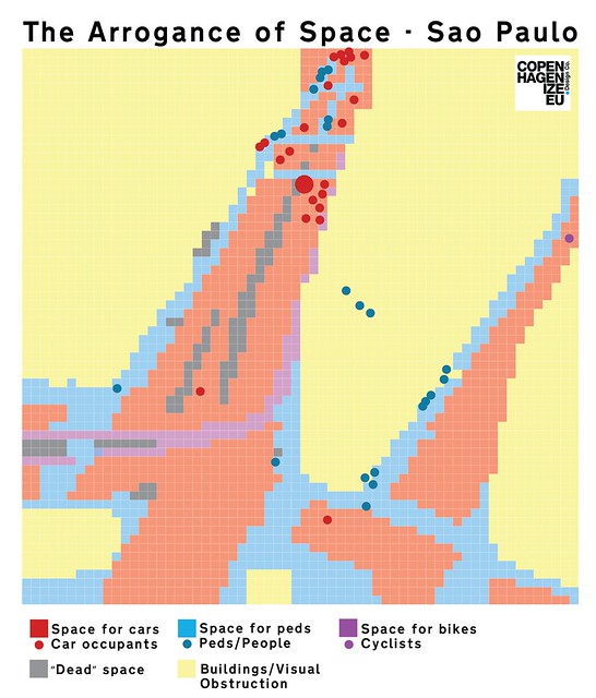
Take away the photo and The Arrogance of Space is revealed. We doubt that the street on the left actually needs four lanes. Narrow them down, expand the sidewalks and implement cycle tracks on both sides.
It’s what a modern city would do.


