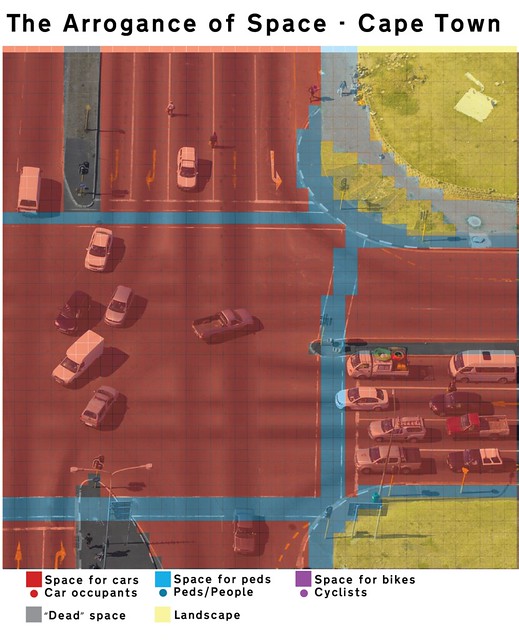
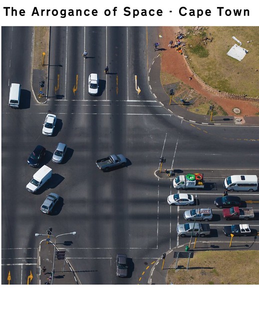
Another chapter in our ongoing series about The Arrogance of Space. This photo was taken by a friend flying to Cape Town. We are not familiar with the specifics of the location - probably near the airport - but that doesn’t stop us from slapping our Arrogance of Space filter onto the photo. It’s a badass intersection - the kind that makes old school traffic engineers feel all warm and fuzzy. It’s a monster of extreme arrogance. Let’s face it… if you have space for vendors to stroll down the car lanes (top centre), your lanes are arrogantly wide.
Firstly, here is how the space is allocated. An ocean of car-centric red. Thin pedestrian crossings with fading paint. No bicycle infrastructure is present.
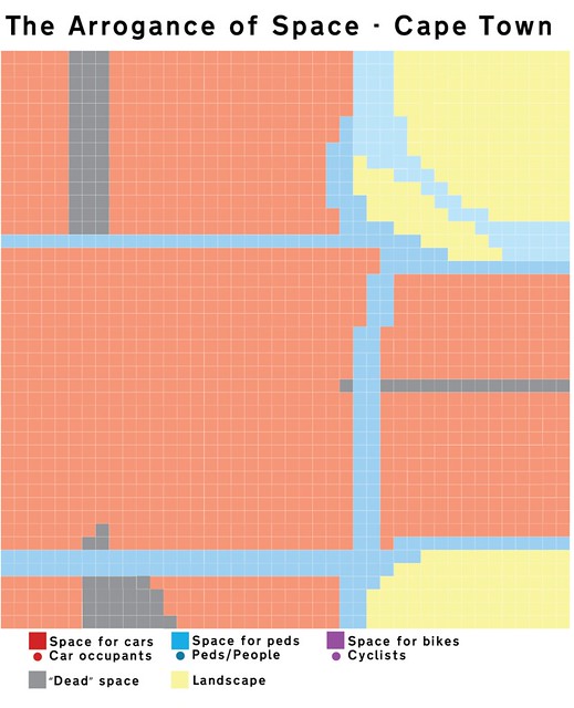
Take away the photo and it looks like this. Making the red all the more shocking.
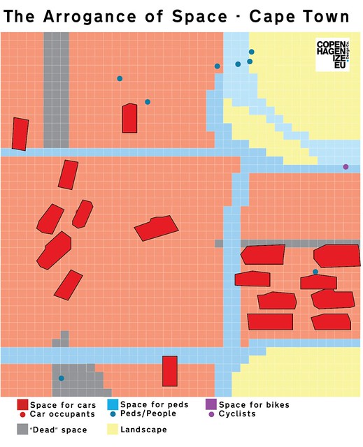
There were a few pedestrians and vendors present when the photo was taken. A couple of mini-vans transporting people, but generally - like most places - just individuals in one car.
The sea of red is still expansive, despite marking off the actual space occupied by cars.
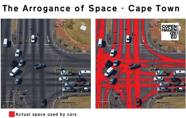
The great thing about this photo is that the cars do the work for us. On the photo at left, the whiteish areas rarely see any car tire action. In the photo at right, we just did a simple “colour replace”, removing the darkened trajectories of the cars with a more noticeable colour. At right you can see clearly that it is a classic, textbook example of The Arrogance of Space.
