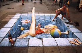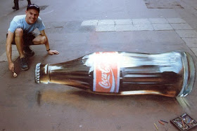
In Vancouver, Canada there is another example of placing a 3D image on the street in order to get motorists to slow down. In this case it's an image of a child picking up a ball in the middle of the street.
In a previous post we highlighted a warning symbol on a road outside a Danish school. The child in the middle of the street is taking the idea to the next level.
Good idea? Bad idea? Some criticism includes that drivers will think that all children on the streets are 3D images and just run them over once they've figured out the system. A bit far-fetched. It's fair comment that motorists on these stretches WILL figure out that the 3D kid is just 3D and not worry much about it after a couple of days.Indeed, a test of fake 3D speed bumps in Phoenix had this result a few years back."Initially they were great," said the Phoenix Police traffic coordinator, Officer Terry Sills. "Until people found out what they were." According to Boingboing.net.
What about using a constantly changing series of images and placing them on the streets? The whole gimmick has legs because it's cheap to put into place. Stickers are cheaper than speed bumps. So keep switching the stickers.Martin Lindstrom in his neuroscience book Buy-ology concluded that cigarette warning labels are very effective ads instead of warnings, the suggestion was that cigarette warnings should be changed regularly. So that the consumer was always kept thinking and forced to read the text instead of having a Pavlovian reaction upon seeing the same warning labels all the time.
We could also just cut to the chase and go the whole nine yards: Or, since city councils are seemingly so unwilling to part with funding that will make serious improvements in traffic safety, why not sell adverts in the middle of the road? A holiday company or a soft drink? Yeah, okay. Maybe not.Of course, redesigning the roads permanently is the best option to improve traffic safety and encourage cycling and pedestrians. But yuck! That costs money!Okay, here's another alternative from the Copenhagenize thinkthank. We have to be fair and include cyclists in such campaigns, of course. 3D texts with sensible messages for the different traffic users: Variations could include Stop Fucking Hurting Innocent People!, Stop Fucking Polluting!, You Look Lovely on that Bicycle!, Enjoy Your Bicycle Ride! And so on.Over the top?Via: the always excellent How We Drive blog by Tom Vanderbilt.


