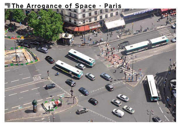
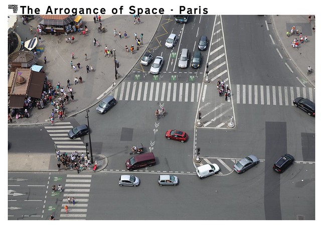
 Yeah, so, there I was on summer holidays with the kids, standing atop the Eiffel Tower in Paris. Been there, done that many times before, but it’s always a beautiful experience looking out over a beautiful city. If you’re afraid of heights, the rule of thumb is “don’t look down”. When you work with liveable cities, transport and bicycle urbanism… it would seem that this rule applies as well. Don’t look down. I did, however. I looked down at the intersection on Quai Branly where it meets Pont d’Iéna over the Seine. This is a place with easily hundreds of thousands of visitors every year and more and more cyclists. It is also clearly a place dominated by The Arrogance of Space of last century traffic engineering. It is a museum for failed, car-centric traffic planning - sad and amusing all at once.
You may recall my earlier article about The Arrogance of Space in traffic planning. I talk a lot about it in my keynotes, this Arrogance of Space and I decided to revisit it.
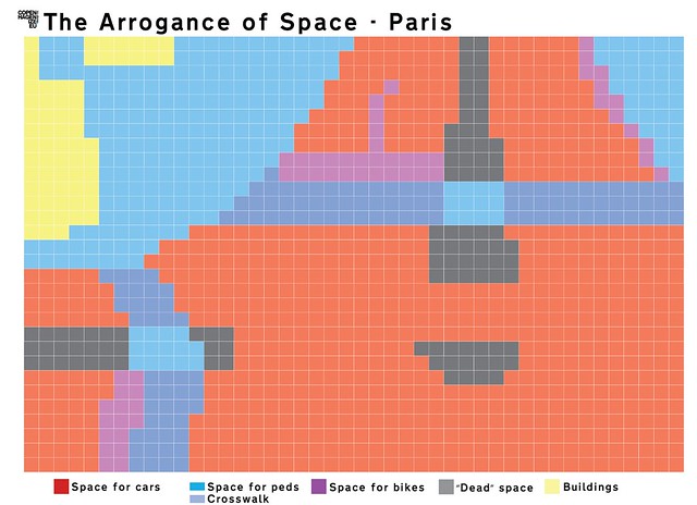
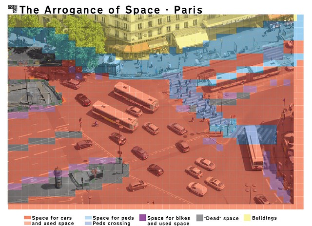
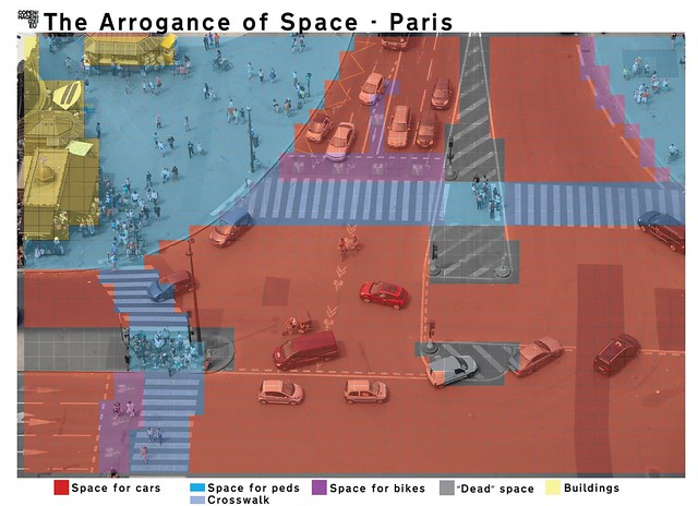 I did a simple thing. I squared off the photo with (very roughly) one square metre squares. It's not totally exact and it doesn't really matter. Creating this grid, I gave the urban space colours based on who it is intended for. It's pretty self-explanatory above. Worth noting, however, that while I reluctantly gave the goofy bike boxes the "space for bikes" colour, I refused adamantly to do so for the sharrows in the intersection. They are ridiculous and should never, ever, be classified as bicycle infrastructure. With the colours you soon see how much space is allocated for motorised transport. Arrogantly so.
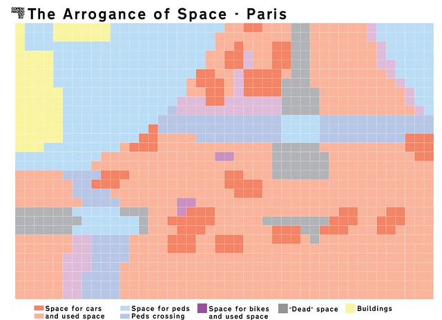
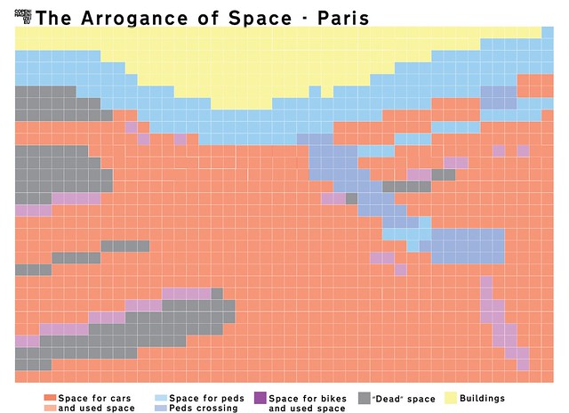
Removing the photo gives you an even better idea of the blatant injustice of space allocation.
In this version I roughly mapped out the actual space taken up by the motorised vehicles (dark red) and bicycles (dark purple). There were only two bicycle users and a pedicab with two passengers in the intersection at this moment. Yes, cars take up a lot of space, but man... look how much space they don't even occupy. Space that could easily be reallocated to a few hundred thousand pedestrians and many bicycle users.
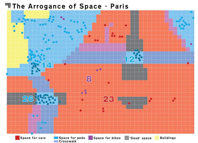
When you actually count the number of individuals using the space the injustice becomes more and more apparent. The Arrogance morphs into pure mocking of the majority of citizens and visitors to the city. Pedestrians clustered together at crossings waiting for The Matrix to reluctantly grant permission to cross. Bicycles thrown to the hyenas into the middle of the Red Desert.
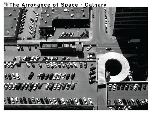
Clotilde, an urban planner here at Copenhagenize Design Company, gave me another photo. This one taken from the Montparnasse Tower in Paris. The intersection is Boulevard du Montparnasse around Place du 18 Juin 1940. Here is the space allocated to motorised transport... including, it's worth noting, a number of buses. Simplied further, there is an arrogant ocean of red and bits and pieces of painted bike lanes. Bikes heading to the right can use the bus lane on the Boulevard, which isn't exactly pleasant. I've tried it. Here are the individuals using the space. Buses are great, of course, so let's count on 50+ people on board. But still a shocking amount of space for a few red dots. Only one bicycle user in the middle of nowhere safe. This photo was taken in 2011, by the way, so a lot of that "dead" space is probably repurposed.For contrast, I found this photo taken from the Calgary Tower in my archives. The first Arrogance of Space article was based on Calgary, so let's revisit the city. Sure, I shot this photo facing south and that's the roof of a car park in the foreground, but let's add some colour.
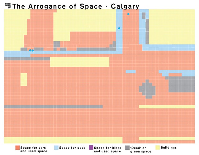
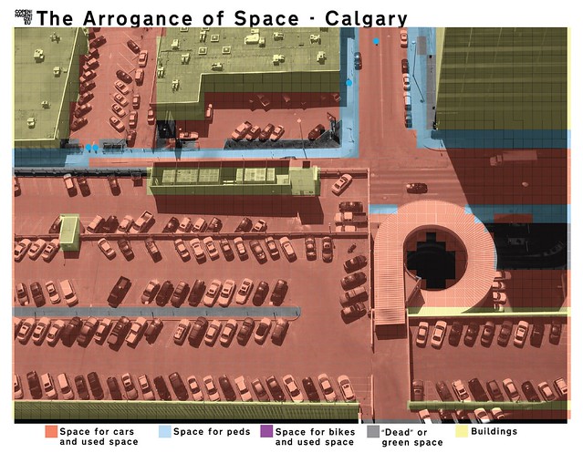 Mars. The Red Planet.
I only marked out the space I could see, so sure... that sidewalk at middle right will continue to the left, but I couldn't see it.
In a liveable city you should be able to climb to a high place, look down at any given moment and see humans in the urban theatre. In this shot I could only see four human forms.
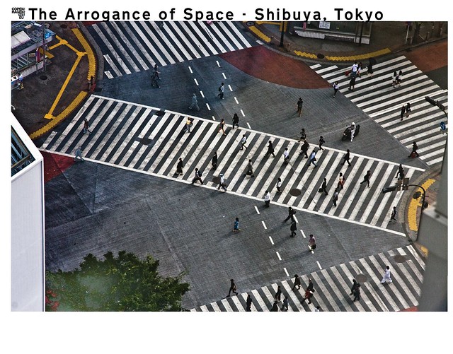
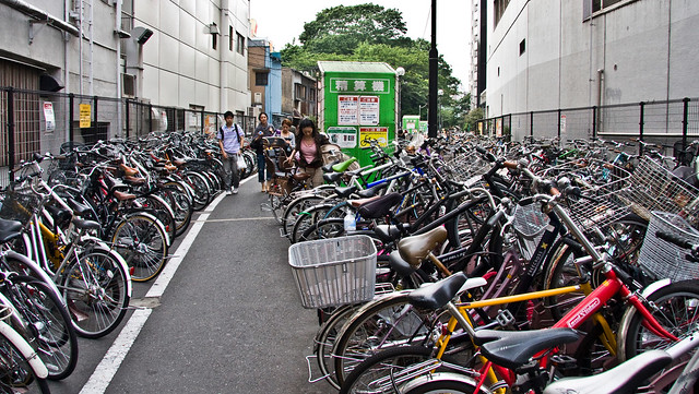
For contrast to the contrast, this is the view from my favourite hotel in Tokyo, overlooking the Shibuya crossing - which just may be the world's busiest crosswalk. I don't stay anywhere else when I'm in Tokyo simply because I love this view. There are often bicycles in the crossing, as you can see in the film, above, that I shot a few years ago. There are probably more bikes in the bike parking areas around nearby Shibuya Station than in many countries.
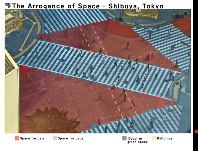
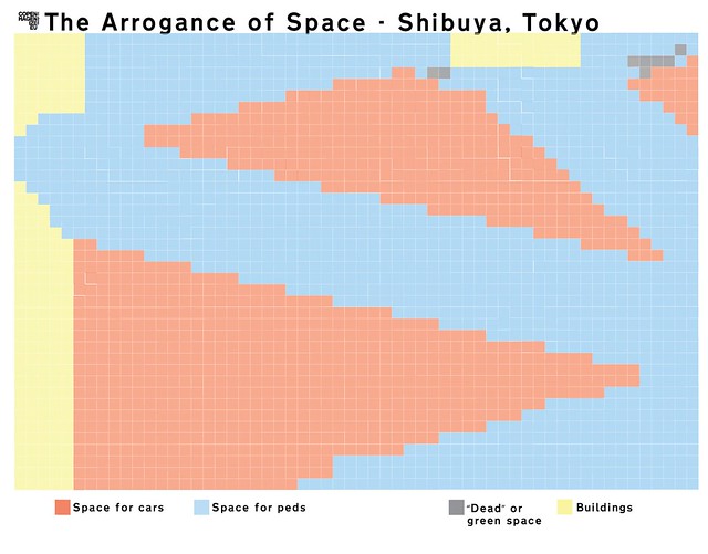
Time for some colour. No bike infrastructure here but goodness me... look at that blue.
According to my EXIF info I took this on Friday, May 22, 2009 at around noon. Not so busy at this moment, but still great to see. Pedestrians here get their own signal in all directions, including diagonally.
If we want to change our failed traffic planning tradition from a previous century, it's time to change the question.
